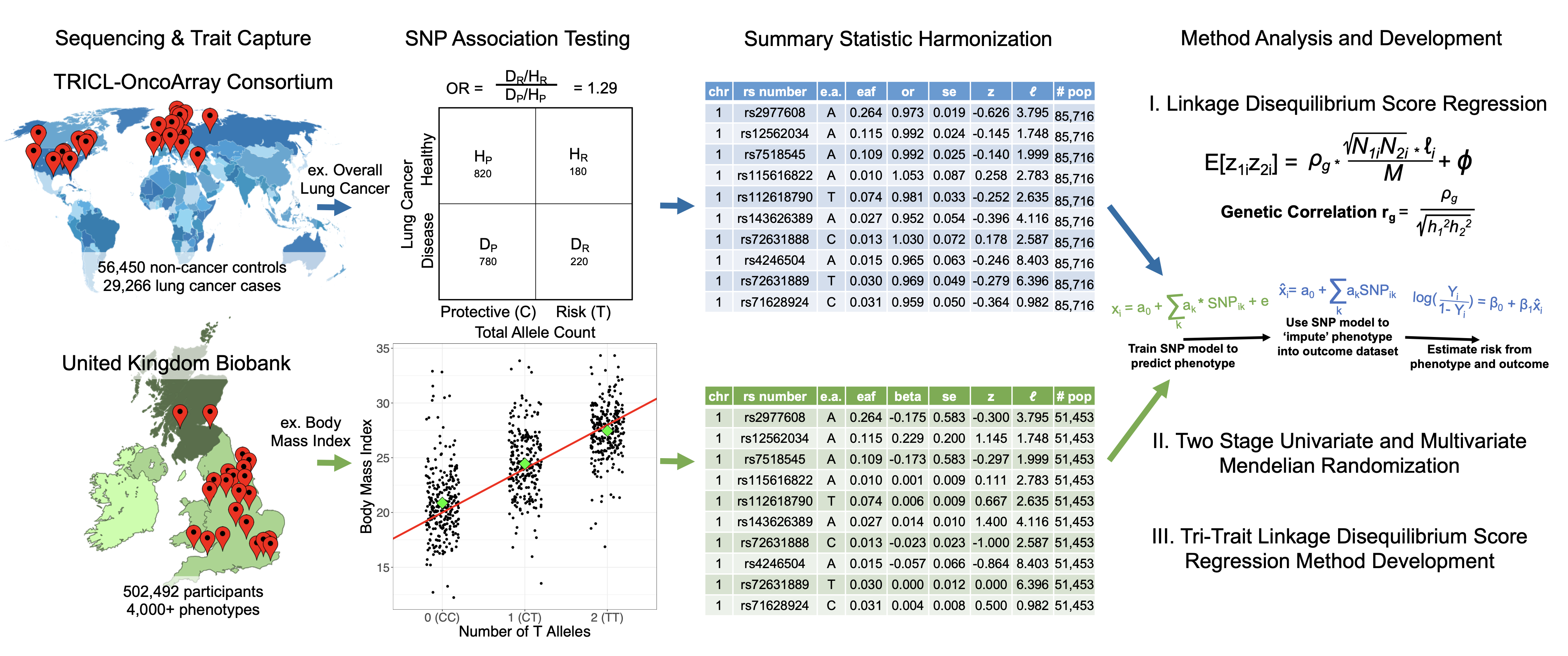
My PhD thesis applied statistical genetics methods to understand lung cancer. This page walks through the field from first principles: what genetic data looks like, how we find disease associations, why those associations are tricky to interpret, and how we can use genetics to ask causal questions.
Part 1: The Basics
Reading a genome
If any of the machinery below feels abstract, these build it from the bottom up: what DNA is, what a SNP actually is, and then how a lab turns a tube of blood into the matrix of numbers everything else in this page operates on. The last one draws that 0/1/2 genotype matrix explicitly, which is the step most explanations skip.
What is DNA?
DNA is a molecule made of four chemical bases: Adenine, Thymine, Guanine, and Cytosine. Your genome is a sequence of about 3 billion of these letters, split across 23 pairs of chromosomes.
The key fact: 99.9% of your DNA is identical to everyone else’s. The interesting part is the 0.1% where we differ.
What is a SNP?
A SNP (single nucleotide polymorphism, pronounced “snip”) is a position in the genome where people have different letters. At most positions, everyone has the same base. But at about 4-5 million positions, there’s variation.
html`<div style="font-family: system-ui, sans-serif; max-width: 700px; margin: 20px 0; padding: 20px; background: #fefce8; border-radius: 8px;"> <svg viewBox="0 0 650 200" style="width: 100%; height: auto;"> <text x="20" y="25" font-size="14" fill="#854d0e" font-weight="bold">A SNP is a position where people differ:</text> <!-- Person 1 --> <text x="20" y="65" font-size="13" fill="#666">Person 1:</text>${["A","T","G","C","C","A","T","G","G","A","C","T"].map((base, i) => {const colors = {A:"#ef4444",T:"#22c55e",G:"#3b82f6",C:"#f59e0b"};const isSNP = i ===5;returnsvg` <rect x="${100+ i *28}" y="${45}" width="25" height="28" rx="3" fill="${isSNP ?'#fef08a':'#f8fafc'}" stroke="${isSNP ?'#ca8a04':'#e2e8f0'}" stroke-width="${isSNP ?2:1}"/> <text x="${112+ i *28}" y="66" text-anchor="middle" font-size="15" fill="${colors[base]}" font-weight="bold" font-family="monospace">${base}</text> `; })} <!-- Person 2 --> <text x="20" y="115" font-size="13" fill="#666">Person 2:</text>${["A","T","G","C","C","G","T","G","G","A","C","T"].map((base, i) => {const colors = {A:"#ef4444",T:"#22c55e",G:"#3b82f6",C:"#f59e0b"};const isSNP = i ===5;returnsvg` <rect x="${100+ i *28}" y="${95}" width="25" height="28" rx="3" fill="${isSNP ?'#fef08a':'#f8fafc'}" stroke="${isSNP ?'#ca8a04':'#e2e8f0'}" stroke-width="${isSNP ?2:1}"/> <text x="${112+ i *28}" y="116" text-anchor="middle" font-size="15" fill="${colors[base]}" font-weight="bold" font-family="monospace">${base}</text> `; })} <!-- Arrow pointing to SNP --> <line x1="240" y1="135" x2="240" y2="155" stroke="#ca8a04" stroke-width="2"/> <polygon points="235,155 245,155 240,165" fill="#ca8a04"/> <text x="240" y="185" text-anchor="middle" font-size="13" fill="#854d0e" font-weight="bold"> This is a SNP </text> <text x="240" y="200" text-anchor="middle" font-size="11" fill="#666"> Person 1 has "A", Person 2 has "G" </text> </svg></div>`
At this SNP, some people have an A and others have a G. We call these the two alleles (versions) of the SNP.
How do we measure SNPs? Genotyping arrays
We can’t afford to sequence everyone’s full genome (3 billion letters). Instead, we use genotyping arrays (also called SNP chips or microarrays) that measure only the positions where people differ - typically 500,000 to 2 million SNPs.
The output is a big matrix: rows are SNPs, columns are people, values are 0/1/2. With modern arrays and biobanks, we have data on millions of SNPs across hundreds of thousands of people.
Part 2: Finding Disease Variants
Running a GWAS
The same argument as this section, from people who teach it for a living. Rob Brown's three-part run is the one I would watch in order: what a GWAS asks, the per-SNP regression that answers it, and then why running a million tests forces that brutal 5x10⁻⁸ threshold. The Oxford clip is the best dedicated explanation of how a Manhattan plot is actually constructed.
The question: which SNPs affect disease?
Now we have genetic measurements. The natural question: are certain variants more common in people with a disease?
This is what a genome-wide association study (GWAS) answers.
How GWAS works
For each SNP, we compare the frequency of each allele in cases (people with disease) versus controls (people without disease). If one allele is significantly more common in cases, that SNP is “associated” with the disease.
We do this test for every SNP - typically 500,000 to 5 million tests. Because we’re doing so many tests, we need a very stringent significance threshold (p < 5×10⁻⁸) to avoid false positives.
Manhattan plots: visualizing GWAS results
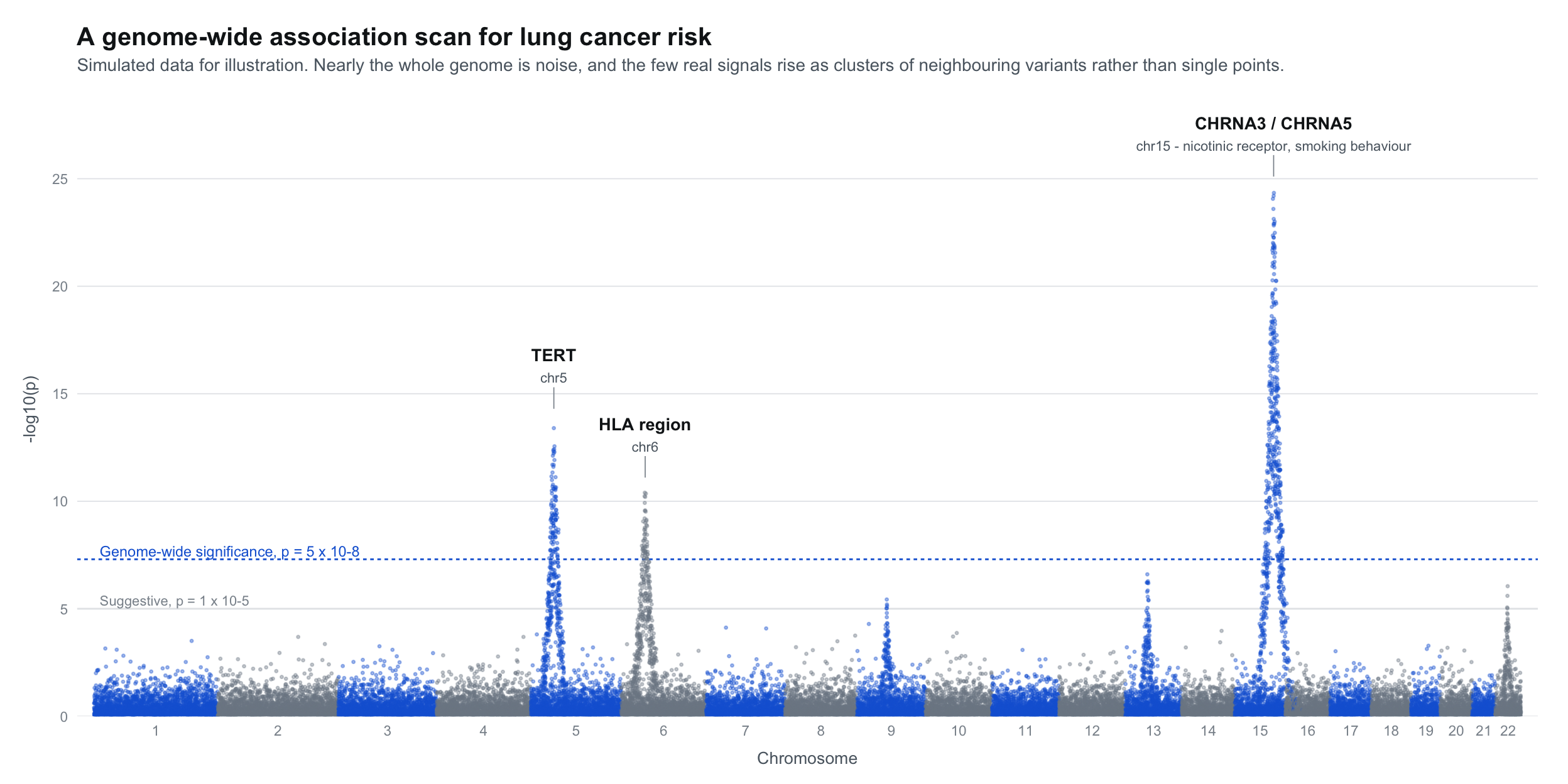
The results are displayed in a “Manhattan plot” - named because the peaks look like a city skyline.
Look at how flat the genome is almost everywhere, and then at the three places where it is not - the CHRNA3/CHRNA5 signal on chromosome 15 towers over everything else, and each real hit arrives as a cluster of neighbouring variants rather than one lucky SNP.
Each dot is one SNP. The x-axis shows position in the genome (chromosomes 1-22 plus X). The y-axis shows how strongly that SNP is associated with the disease (-log10 of the p-value, so higher = more significant).
Peaks above the red significance line are “hits” - SNPs associated with the disease.
Part 3: The LD Problem
Why the peaks are clusters
Linkage disequilibrium is the concept that took me longest to hold properly, because it is both the reason GWAS works at all and the reason its answers are ambiguous. These build it in the right causal order: recombination first, then LD as its consequence, then r-squared as the way to measure it. The last one is about fine-mapping, which is the formal attempt to pick the causal variant out of its correlated neighbours.
So far so good - run a GWAS, find associated SNPs, done. But here’s the complication: those peaks in the Manhattan plot aren’t single SNPs. They’re clusters. Why?
Chromosomes are inherited in chunks
Each parent has two copies of each chromosome. When making eggs or sperm, these two copies can swap pieces - this is called recombination. The child then gets one (possibly recombined) chromosome from each parent.
But recombination is rare - only about 1-2 crossovers per chromosome per generation. So nearby regions of the chromosome travel together.
What this creates in a population: linkage disequilibrium
Over many generations, this creates a pattern called linkage disequilibrium (LD): nearby SNPs are correlated. If you know someone’s genotype at one SNP, you can often predict their genotype at nearby SNPs.
If one SNP actually causes disease, all the nearby SNPs that are correlated with it will also appear associated with the disease - even though they’re just bystanders.
gwasSignals2 = [ {pos:-100,signal:2,isCausal:false},// far - gray {pos:-60,signal:4.5,isCausal:false},// medium - orange {pos:-30,signal:7,isCausal:false},// close - orange {pos:0,signal:10,isCausal:true},// causal - red {pos:30,signal:7,isCausal:false},// close - orange {pos:60,signal:4.5,isCausal:false},// medium - orange {pos:100,signal:2,isCausal:false},// far - gray]html`<div style="font-family: system-ui, sans-serif; max-width: 700px; margin: 20px 0; padding: 20px; background: #fef2f2; border-radius: 8px;"> <p style="margin: 0 0 10px 0; font-size: 14px; color: #991b1b; font-weight: bold;">One causal SNP creates many "hits"</p> <svg viewBox="0 0 600 240" style="width: 100%; height: auto;"> <!-- Significance line at signal = 3 --> <line x1="50" y1="130" x2="550" y2="130" stroke="#dc2626" stroke-width="2" stroke-dasharray="6,4"/> <text x="555" y="134" font-size="10" fill="#dc2626">significance threshold</text> <!-- Axes --> <line x1="50" y1="180" x2="550" y2="180" stroke="#666" stroke-width="1.5"/> <line x1="50" y1="180" x2="50" y2="30" stroke="#666" stroke-width="1.5"/> <text x="300" y="200" text-anchor="middle" font-size="11" fill="#666">Position on chromosome</text> <text x="25" y="105" font-size="11" fill="#666" transform="rotate(-90, 25, 105)">-log(p-value)</text> <!-- SNP dots - signal * 15 for y position, threshold at signal=3 means y=135 -->${gwasSignals2.map(snp =>svg` <circle cx="${300+ snp.pos*2}" cy="${180- snp.signal*15}" r="${snp.isCausal?14:10}" fill="${snp.isCausal?'#dc2626': snp.signal>3?'#fb923c':'#94a3b8'}"/> `)} <!-- Legend --> <rect x="50" y="210" width="500" height="26" rx="4" fill="#fef2f2"/> <circle cx="90" cy="223" r="7" fill="#dc2626"/> <text x="105" y="227" font-size="11" fill="#333">Causal SNP</text> <circle cx="230" cy="223" r="7" fill="#fb923c"/> <text x="245" y="227" font-size="11" fill="#333">Correlated SNPs (in LD) - also significant!</text> <circle cx="470" cy="223" r="7" fill="#94a3b8"/> <text x="485" y="227" font-size="11" fill="#333">Far away</text> </svg></div>`
This is why Manhattan plots have broad peaks, not single spikes. Each peak is one (or a few) causal variants plus many correlated neighbors that get “dragged along” due to LD.
Quantifying LD
We measure LD with a statistic called r²:
r² = 1: Two SNPs are perfectly correlated (always inherited together)
r² = 0: Two SNPs are independent (no correlation)
LD decays with distance - nearby SNPs have high r², distant SNPs have low r².
So we’ve run a GWAS and have thousands of associated SNPs. But many are just correlated with causal variants (the LD problem), and we want to understand the bigger picture. What can we actually learn?
LD Score Regression (LDSC)
Turning LD into a tool
The first video is the tightest explanation I have found of what the LDSC slope and intercept each mean. The two lectures after it are from the Broad group that wrote the method, one on heritability and one on genetic correlation, and they are the authoritative treatment if you want the real thing rather than my summary. The last two cover population structure, which is the confounder the intercept is trying to warn you about.
LDSC is a method that turns the LD problem into a feature. Instead of being confused by correlated SNPs, we use the pattern of correlations to learn about the trait.
The key insight: If a trait is truly affected by many variants across the genome (polygenic), then SNPs in high-LD regions should show stronger GWAS signals on average. Why? Because a SNP in a high-LD region is correlated with more of its neighbors, so it “tags” more potential causal variants.
Slope = heritability signal: If a trait is affected by many genetic variants, SNPs in high-LD regions will tag more of them, so their χ² statistics will be higher. The steeper the slope, the more heritable the trait.
Intercept = confounding check: The intercept should be ~1 if there’s no confounding. If it’s elevated, something other than genetics (like population structure or cryptic relatedness) is inflating results.
But the real power is comparing traits. If we have GWAS results for two different traits, we can ask: do the same SNPs tend to affect both?
This is powerful: we can measure the genetic overlap between any two traits that have been studied with GWAS - even if they were measured in completely different people.
Mendelian Randomization: From Correlation to Causation
Genes as a natural experiment
Start with the two-minute primer: that is George Davey Smith, who named the method, explaining it faster than I just did. The workshop series then walks through why observational epidemiology fails, what the three assumptions actually require, and where MR breaks down. The last three are from econometrics rather than genetics, and they are worth the detour: Mendelian randomization is an instrumental variable design, and economists have been arguing about instrument validity for decades. Their treatment of the exclusion restriction is sharper than most genetics teaching on the same point.
GWAS and LDSC tell us about associations. But the question we really want to answer is: does one thing cause another?
Observational studies struggle with this. If smokers have higher lung cancer rates, is it because smoking causes cancer? Or because the same factors (stress, socioeconomic status, personality) lead to both smoking and cancer?
Mendelian randomization (MR) uses genetics to cut through this problem.
The core insight: Your genetic variants were assigned randomly at conception - like a natural coin flip. Unlike your behaviors or environment, your DNA wasn’t shaped by confounding factors. This makes genetics a powerful tool for causal inference.
The three assumptions (all must hold for valid inference):
Relevance: The genetic variants must actually affect the exposure (smoking). We verify this with strong GWAS associations.
Independence: The variants can’t be associated with confounders. Because genotypes are assigned at conception before any environmental exposures, this usually holds.
Exclusion restriction: The variants can only affect the outcome (cancer) through the exposure (smoking) - not through other pathways. This is the trickiest assumption. A SNP that affects both smoking and lung function directly would violate it.
We use GWAS “summary statistics” - publicly available results showing how each SNP associates with a trait. We don’t need individual-level data. For MR, we need:
GWAS results for the exposure (e.g., smoking behavior)
GWAS results for the outcome (e.g., lung cancer)
For each SNP that affects smoking, we ask: does its effect on smoking predict its effect on cancer?
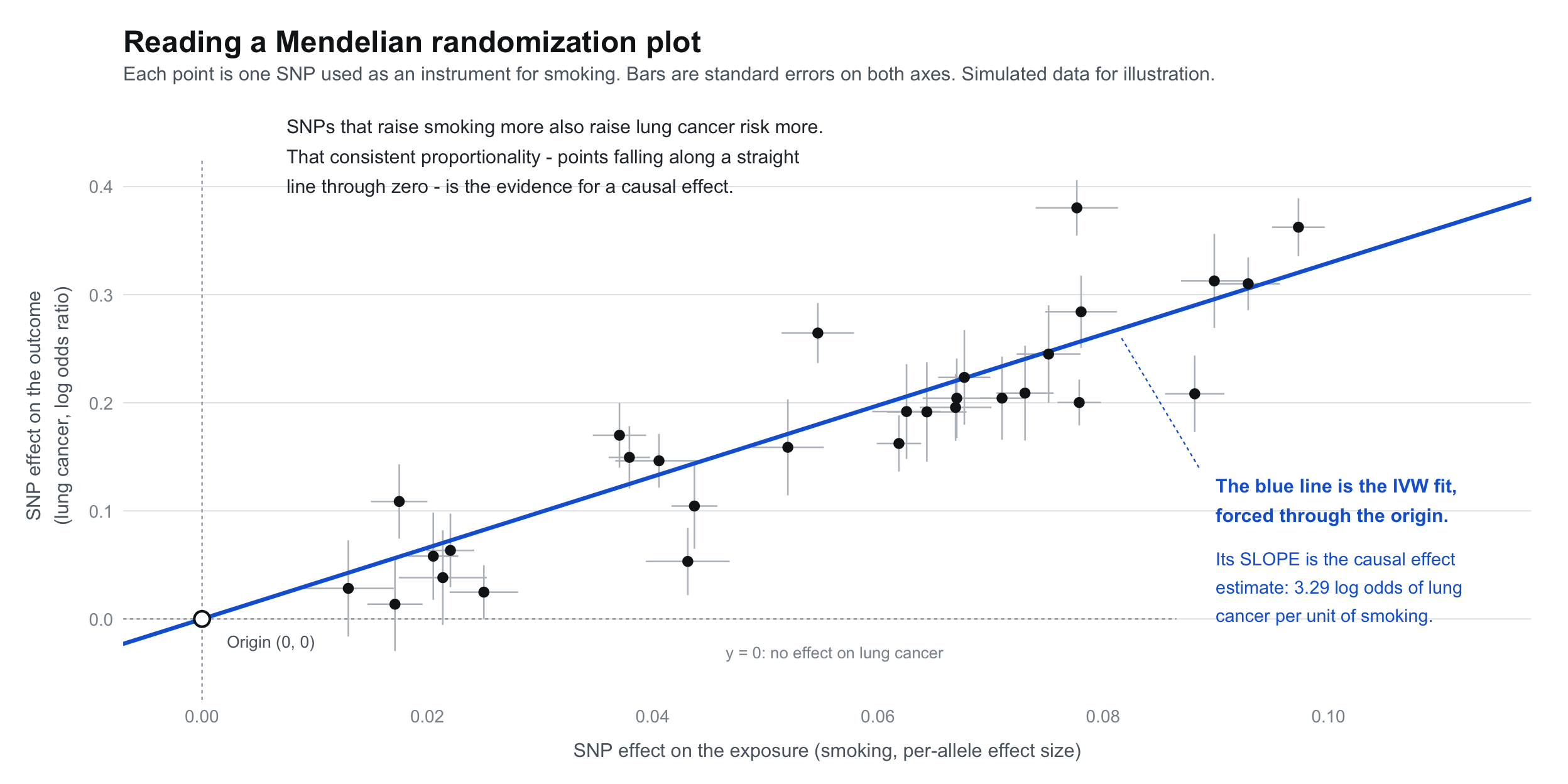
This is the picture I want you to hold in your head when you read the paragraph above: every dot is one SNP, and the thing that matters is the slope of the blue line, because that slope is the causal effect we are trying to estimate.
Reading an MR plot: Each point is a SNP. The x-axis shows how much that SNP affects the exposure (smoking), and the y-axis shows how much it affects the outcome (lung cancer). If smoking causes cancer, the points should fall along a line - SNPs that increase smoking more should proportionally increase cancer more. The slope of that line estimates the causal effect.
Pettit, R., Byun, J., Han, Y., et al. (2023). “Heritable traits and lung cancer risk: a two-sample mendelian randomization study.” Cancer Epidemiology, Biomarkers & Prevention, 32(10), 1421-1435.
Pettit, R., & Amos, CI. (2022). “Linkage disequilibrium score statistic regression for identifying novel trait associations.” Current Epidemiology Reports, 9(3), 190-199.
Pettit, R., Byun, J., Han, Y., et al. (2021). “The shared genetic architecture between epidemiological and behavioral traits with lung cancer.” Scientific Reports, 11(1), 17559.
Mentorship
I worked with Prof. Chris Amos at Baylor College of Medicine (profile).